

Taupe colour: what it is, colour combinations and home decorating ideas
It isn’t grey and it isn’t beige, which is exactly why decorators love it: taupe is the neutral that warms a room without turning yellow, and it gets along with almost everything.
The taupe colour is a warm grey with a brown base: at home it works as a soft neutral, deeper than beige and less cold than grey. It pairs naturally with off-white, sage green, midnight blue, terracotta and oak or walnut, and it looks its best on walls, textiles and floors.
At a glance
- Taupe is a brownish grey; in Italian the same shade is called tortora, after the turtle dove.
- Safe pairings: off-white, cream, sage green, midnight blue, terracotta, black and brass.
- On walls it works best in bright rooms; with little daylight choose a lighter version.
- It suits both pale oak and walnut.
- It is one of the most popular colours for sofas, rugs and floors because it hides everyday wear.
What colour is taupe?
Taupe is grey mixed with a touch of brown. The word comes from the French for mole, the animal whose fur has the same dusty, brownish grey; in Italy the shade is named after the soft plumage of the turtle dove. There is no single taupe: some versions are light and close to sand, others are dark and close to mud or milk chocolate.
The difference from its neighbours lies in the base. Beige starts from yellow and white, grey is neutral or cool, taupe sits in between but leans towards brown. That is why it copes well with warm artificial light in the evening, which tends to turn many greys slightly green.
What colours go with taupe?
Taupe is a background colour: it lets everything else speak. Four combinations work particularly well.
Taupe and white
Off-white or cream, rather than brilliant white, creates a bright and restful room. It is the easiest pairing for living rooms and bedrooms: taupe walls, white ceiling and frames, pale textiles.
Taupe and sage green
Two dusty colours that talk to each other: sage brings freshness, taupe keeps it grounded. It works in kitchens, on bed linen and in bathrooms with plenty of natural light.
Taupe and midnight blue
For a more elegant, contemporary look, add midnight or petrol blue on a sofa, a feature wall or a velvet. Taupe softens the contrast blue would have against white.
Taupe and terracotta
The warmest pair: taupe walls with terracotta accents on cushions, vases and ceramics. It belongs to the family of earth colours. Black, in small doses on metal and frames, gives the scheme structure; brushed brass adds light.
Taupe walls: which rooms suit them?
Taupe walls look best in bright rooms facing south or west, where warm light brings out the brown undertone. In north-facing rooms, with cooler, flatter light, taupe tends to look dull: choose a lighter version or limit it to one wall. Before painting, try a sample of at least one square metre and look at it at different times of day.
In the bedroom taupe is a natural choice: it creates an enveloping backdrop for the headboard and bed linen. In the living room it sits well behind a pale or cream sofa. In the bathroom it partners stone-effect tiles and black or brass taps. To compare shades of grey for walls, see our guide on how to choose the right grey for your walls.
Furniture and materials: where to use taupe
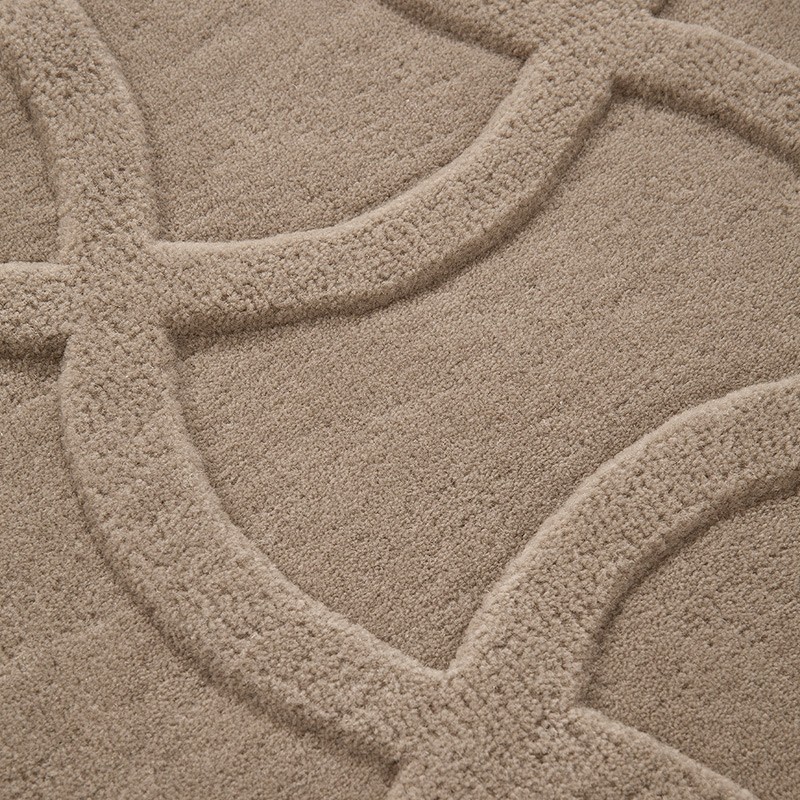
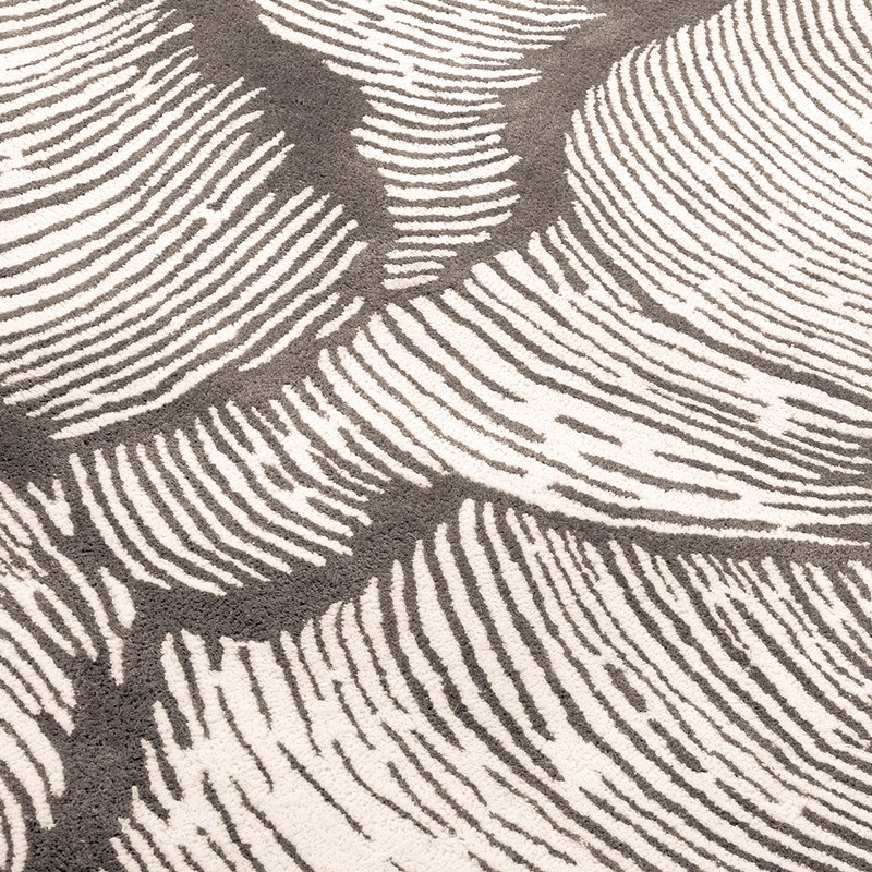
Taupe is one of the most popular colours for sofas, rugs and floors because, unlike white and very light greys, it does not immediately show dust and marks. In the Arredare Moderno catalogue it appears mainly on textiles and surfaces: hand-tufted wool rugs by Mohebban Milano, such as Twiggy Taupe designed by Serena Confalonieri or Oceano by Studio Zero, and Boxer’s Smart Wood SPC flooring in a taupe shade that brings a wood effect in a brownish grey.
Taupe has no problem with wood: with pale oak it becomes light and Nordic, with walnut warmer and more classic. Among metals it prefers matt black, bronze and brass; polished chrome cools it down. On fabrics it is at its best on textured surfaces such as linen, bouclé and velvet, which make its nuances come alive.
Taupe, beige or greige: how to choose?
If the room is dark or you want a sunny feel, beige is the better choice. Greige, halfway between grey and beige, is lighter and less brown than taupe: the right pick if you want an almost white backdrop that is not cold. If you are after an elegant, almost metallic neutral, look at platinum. Taupe is the middle ground: deeper than beige, warmer than grey, and therefore easy to match with existing furniture, including brown pieces.
To build a full palette around a neutral, see our 10 colour palettes for the home and the guide on how to choose a sofa colour. If taupe feels too neutral, olive green is the next step towards a bolder colour.
Frequently asked questions
Is taupe a warm or a cool colour?
It is a warm neutral: the base is grey, but the brown component pushes it towards warm. Lighter versions can look cool in north light.
Is taupe the same as greige?
No. Greige is lighter and closer to beige; taupe has more brown and is usually darker.
What colour sofa goes with taupe walls?
A cream, off-white or sand sofa creates a tone-on-tone effect; a midnight blue or sage green sofa adds character. Avoid a sofa in exactly the same taupe as the walls, which would disappear into the background.
Does taupe work in a small bedroom?
Yes, in a light version with a white ceiling. In a small, dark bedroom it is better used on textiles and the headboard, keeping the walls lighter.
What flooring goes with taupe?
Natural oak, stone-effect porcelain and wood-effect floors in brownish grey tones. A very red floor, such as cherry, clashes with the grey base.
For the origin of the name and its variations, see the taupe entry on Wikipedia.