

Mint green interiors: colour combinations that work with your room
Updated October 2026
Pantone mint green is a light, fresh green with a hint of blue: at home it brings light and lightness and pairs well with white, grey, light wood and brass.
At a glance
- Mint green is a pastel green with a cool, bluish note.
- Pantone’s colour guides include several mint shades, from soft to intense.
- Classic pairings: white, light grey, natural wood; more glamorous: brass, powder pink.
- It works in kitchens, bathrooms and bedrooms, on walls or single pieces.
- In dim rooms, choose the warmer, dustier version.
Mint green can look pale and powdery on one fabric, clearer and brighter on another. That is why choosing mint green colour combinations starts with the actual shade you want to bring home, not just a colour name on a screen.
Decide whether mint will be the background, a main piece of furniture or a smaller accent, then compare it with the room’s existing materials. Flooring, wood finishes and large upholstered pieces are part of the palette already. The most useful scheme is one that acknowledges them rather than treating the room as an empty sample board.
What does mint green mean in interiors?
In everyday furnishing language, the name covers a range of greens rather than one universally identical colour. Paint, upholstery and accessories described as mint may differ in lightness, intensity and undertone.
A photograph offers a starting impression, not an exact match. The lighting used for the image, the surrounding colours and the screen on which you view it can all affect what you see. Request physical samples where the relationship between materials matters.
Before coordinating several purchases, choose one sample as the reference. It is easier to judge a fabric beside the intended wall colour than to compare two separate memories of mint.
The Pantone reference: be precise about the system
The Pantone catalogue includes 17-6333 TCX Mint Green. That reference does not mean every furnishing colour called mint green must match it, nor that it is automatically the pale pastel green shown in an inspirational photograph.
When requesting a colour, give the full code and its reference system. Pantone uses different systems and physical supports. A textile colour reference should not be confused with a paint formulation or a digital value taken from a screen.
If the aim is a painted wall, ask the paint supplier for a sample in the intended finish. A code can help the conversation, but the final choice belongs on the material that will actually be used in the room.
Four mint green palettes to try
These combinations are editorial starting points, not compulsory formulas. For each one, choose a base that already relates to the room and decide how much visual space to give the green.
1. Mint, warm white and pale oak
This combination suits an introduction of colour without making it the only focus. Warm white can provide the background, oak adds a material surface, and mint appears on a wall, a piece of furniture or selected textiles.
Check that the white does not look unexpectedly yellow beside your green and that the floor does not introduce a conflicting undertone. In a room with plenty of existing furniture, begin with a contained accent and expand it only after seeing the combination together.
2. Mint, sand and walnut
The contrast between a fresh green and darker timber creates a more grounded composition. Sand can connect the two, particularly across larger textile surfaces such as curtains or upholstery.
The amount of walnut matters. A small side table has a different presence from a large wall unit. If the room already contains extensive dark wood, place a generous mint sample beside it before committing to every wall.
3. Mint, pale grey and slate
A restrained grey background can accompany mint while slate adds a deeper accent. Consider textured fabrics, timber and other existing materials if the scheme otherwise feels too uniformly cool.
The dark note can remain limited to one element; it need not be repeated on every frame, table and accessory. Our guide to slate grey interiors explains how to compare its variations and choose a suitable role.
4. Mint, white and terracotta
Terracotta makes a more noticeable contrast and can appear in a few objects or a textile. Decide which colour should lead rather than distributing the two accents in identical amounts throughout the room.
A warm-toned floor may already provide the terracotta part of the palette. There is no need to add another object just to reproduce every ingredient of a scheme seen online. Let permanent materials do some of the work.
In the living room: a wall, an armchair or smaller accents?
A mint wall changes the background for everything placed against it. A coloured sofa or armchair concentrates attention on a particular volume instead. Cushions, curtains and accessories create a more contained intervention, without requiring the same green at every point.
If you are considering an accent chair, settle its proportions and purpose before its colour. Our guide to small armchairs helps keep the real footprint in view when a fabric catches your eye.
In an open-plan room, look at the green from the kitchen and dining area too. It has to relate to several viewpoints, not just the front-on view of the seating arrangement.
In the bedroom: choose the background before the details
Mint can provide a background behind the headboard, or it can appear in bed linen while the walls remain more neutral. The two approaches differ in how strongly the colour is present and how easily you can change it.
Do not automatically attribute benefits for sleep or wellbeing to a colour. Instead, decide whether you enjoy the combination at the times you use the room, under both natural light and the bedside lamps.
In a small bedroom, colour is not a solution to an awkward furniture arrangement. Organise the room first, using these small modern bedroom ideas as a starting point, then select a background that works with it.
Test the sample where it will actually appear
Place the sample beside the floor, the main timber finish and the largest textile in the room. Assess it in its intended orientation: a wall colour needs to be viewed vertically, not only lying on a table.
Look in the morning, afternoon and under the evening lights you normally use. Do not change to a temporary lamp simply because it flatters the sample. For paint, compare the planned finish and surface as well as the hue.
Three mistakes worth avoiding
- Buying different materials on the strength of the name mint green alone.
- Repeating the colour everywhere without choosing a main focus.
- Ignoring the permanent colours of flooring, window frames and large furniture.
Mint green works best when it has a clear job: background, focal furniture or accent. Once that role is decided, it becomes easier to leave out additions that complicate the room without improving it.
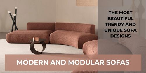
Featured image: Dread, Twils, combining pale green, pink and neutral tones. The photograph is a colour reference, not certification of the upholstery’s Pantone code. Photo credits: www.arredaremoderno.com.
Frequently asked questions
What colour is mint green?
A light, fresh green with a bluish note, inspired by mint leaves.
Is mint green a Pantone colour?
Pantone includes several mint green shades: choose the sample in person, as they change a lot with the light.
What colours go with mint green?
White, light grey, natural wood, brass and powder pink.