

Slate grey interiors: add depth without making the room too dark
Slate grey appeals when you want a deep colour without necessarily choosing black. On a small surface it can create a clear contrast; across walls, furniture and textiles it can change the balance of the whole room. Before deciding what to pair it with, decide what you want it to emphasise.
Consider the extent of the dark surface, the available light and its contrast with the floor and furnishings together. There is no ideal percentage for every interior. A low cabinet and an entire wall have different effects even when their colour is similar.
What colour is slate grey?
In furnishing descriptions, slate usually refers to a family of deep greys, sometimes with a cool undertone. The name comes from the natural material, but paint, fabric and ceramic surfaces labelled slate are not automatically the same shade.
The stone itself can vary, too. Distinguish a slate-inspired colour from actual slate as a material. If you are choosing a table or wall finish, ask both what the product is made from and how its colour is described.
A commercial colour name helps you navigate a collection. It does not replace a sample or the information about care and performance that belongs to the particular material.
Slate, charcoal and grey: compare samples, not names
These descriptions can cover neighbouring shades, but they do not form a universal scale. One supplier may use slate for a bluish grey while another applies it to something more neutral.
Place the samples beside one another on a light background, then take them into the room. Notice which looks bluer, which feels warmer and which comes closest to black. This comparison is more useful than selecting a digital code without reference to the actual product.
Different materials need not match exactly. An intentional difference in depth or texture can look more convincing than two nearly identical surfaces that appear to be an unsuccessful match.
Three slate grey colour combinations
Slate, pale oak and warm white
Light timber and a bright base let slate serve as a defined contrast. It might appear on a sideboard, one area of wall or a metal structure, while the rest of the room retains a lighter presence.
Look at the timber’s undertone. A yellow-toned oak produces a different relationship from a more neutral finish. If an existing floor is visually prominent, begin there and select the white beside both the floor and slate samples.
For a lighter version: keep the palette but move slate from the largest surface onto a single item of furniture or a few details. The contrast remains clear without darkening every wall.
Slate, sand and textured natural fabrics
A sandy shade can form the background for slate furniture, while fabrics with a visible weave add variation. The interest comes from the relationship between surfaces, not from repeating one grey across every object.
Try this combination carefully where flooring and window frames already have different warm tones. Adding another beige without comparing them may make the palette less coherent rather than softer.
For a lighter version: choose the main textiles in a pale shade and limit the deep grey to a contained surface. You need not abandon slate, only give it a smaller role.
Slate, mint green and a neutral base
Mint can introduce a fresher accent beside a deep grey. Decide which should attract more attention so the two do not compete. A mint chair against a neutral background with a few slate elements is one possible arrangement.
The particular green matters just as much as the grey. Our guide to mint green interiors explains how to compare the physical samples and materials.
For a lighter version: leave the room’s background neutral and place the two colours on elements of different sizes, rather than spreading both over large surfaces.
A whole wall or one piece of furniture?
A slate wall changes the relationship with everything in front of it. If that wall already holds furniture, shelves and many objects, the composition may become more complex than the paint sample suggests. Consider the empty areas as well as the items you plan to display.
A dark piece of furniture concentrates the decision on one volume. A low sideboard, tall bookcase and dining table have very different presences even in similar colours. Avoid attributing an effect to the shade when the size of the furniture is doing much of the work.
For a table, consider the relationship between its top and base. Our article on ceramic dining tables explores how surfaces and structures contribute to the composition. Choose the material separately from the colour name.
Using slate in a room with limited daylight
Before painting, observe when you actually use the room. An interior used mainly in the evening is experienced under artificial lighting. A decision made at midday does not show the full picture.
Try a sufficiently large sample in the intended position and compare it with nearby furnishings. If the contrast makes an area feel more enclosed than you want, reduce the dark surface or choose a less deep variation.
A glossy finish or a pale wall elsewhere will not automatically solve an unsuitable lighting arrangement. Colour and lighting need to be considered together, with the ordinary viewpoints from the doorway and seating included.
Matt, glossy and textile surfaces behave differently
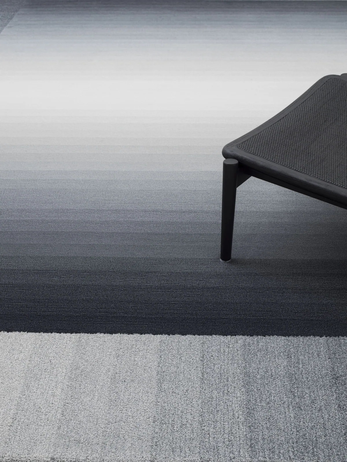
A glossy surface shows reflections that change with your position. A matt finish has a different visual effect, while fabric can vary with its weave or the direction of its pile. View samples at an angle as well as straight on, and in the position where they will be used.
For upholstery, think about the extent of the covered surface. A tiny swatch will have a different presence when enlarged to a sofa. If you want a smaller accent, a compact armchair is worth considering, alongside comfort and its actual footprint.
How to know when you have enough grey
Before adding another slate element, ask what it will connect or emphasise. If the only answer is to repeat the colour, the addition may be unnecessary.
A coherent palette does not require every object to have a colour-matched partner. One main element, supported by compatible materials and a well-chosen background, can be enough. Leaving something lighter or quieter allows that main element to remain readable.
Look at the room from the places where you enter and sit. If the colour helps you understand the composition rather than making the elements you value blend into one dark area, it has found a useful role.
Featured image: Dread, Twils. A dark wall, grey bed and yellow accents illustrate a balance of deeper and lighter tones. Assess the exact colour using a physical sample. Photo credits: www.arredaremoderno.com.