

Dusty pink colour: what it is, colour pairings and decorating ideas
Not the sugary pink of a nursery, nor the bright pink of the catwalk: dusty pink is a muted, greyed rose with a hint of brown that behaves almost like a warm neutral at home. Here is how to recognise it, which colour codes to look for and how to pair it room by room.
Dusty pink is a soft, muted shade of pink, as if grey and a touch of brown had been stirred into it: that is why it looks more grown-up and less sweet than pastel pink. In interiors it works as a gentle background colour that warms walls without shouting, and it sits naturally alongside taupe, greige, sage green, grey, timber and brass.
In short
- Dusty pink, also called old rose, is a desaturated pink with a warm undertone: elegant, not childish, easy to pair.
- In the RAL Classic range the reference is RAL 3014 Antique pink.
- The closest Pantone shades for textiles and interiors are Dusty Rose 17-1718 TCX, Ash Rose 17-1514 TCX and Woodrose 16-1806 TCX.
- Safe pairings: taupe, greige, sage green, pale grey, light and mid-tone woods, leather, brass.
- On walls it looks best in a matt finish, and you should always test a sample in daylight and in the evening.
What colour is dusty pink?
Dusty pink is a muted pink with a grey component that makes it look powdery and a brown component that warms it up. The name evokes old textiles and wallpapers whose pigments had softened with time and sunlight. Its older English name is old rose: according to the Wikipedia entry on old rose, the first recorded use of the term as a colour name in English dates from 1892, and it was a much-loved Victorian colour.
Compared with other pinks, dusty pink has two qualities that suit the home. It has low saturation, so it does not tire the eye on large surfaces, and it has a warm undertone that works well with wood, natural fabrics and golden metals. It is the same reason warm neutrals such as taupe are so easy to live with, and dusty pink shares their slightly brown base.
What are the colour codes for dusty pink?
The most useful codes are RAL 3014 for paints and coatings and a handful of Pantone shades from the textile and interiors library. RAL Classic is the four-digit colour collection managed by RAL: it started with 40 shades and now has 216, and the 3000 series covers the reds. Within it, 3014 is Antique pink.
For fabrics, cushions and upholstery, the reference is the Pantone Fashion, Home + Interiors system. An interesting detail: Pantone places Dusty Rose, Ash Rose and Woodrose in its orange colour family, which confirms that dusty pink is a pink that leans warm.
| System | Code and name | Typical use |
|---|---|---|
| RAL Classic | RAL 3014 Antique pink | paints, lacquered and powder-coated surfaces |
| Pantone FHI (TCX) | 17-1718 TCX Dusty Rose | fabrics, upholstery |
| Pantone FHI (TCX) | 17-1514 TCX Ash Rose | fabrics, rugs |
| Pantone FHI (TCX) | 16-1806 TCX Woodrose | fabrics, accessories |
| Pantone FHI (TCX) | 14-1506 TCX Rose Smoke | lighter version for bed linen and curtains |
A practical note on the hex codes that circulate online: RAL states that the technical values of its colours are protected by copyright and that using them requires a licence agreement. For that reason, and because screens are misleading, make the final choice from a physical sample, not from your monitor.
Dusty pink, blush, mauve and powder pink: what is the difference?
The difference lies in the undertone and the amount of grey: dusty pink is the warmest and most earthy, blush the palest, mauve the coolest because it drifts towards violet. These are everyday names rather than codes, so every manufacturer interprets them differently; the table below is a rough guide.
| Shade | Character | Where it works best |
|---|---|---|
| Dusty pink | muted, warm, with a brown note | walls, upholstery, bedrooms and living rooms |
| Blush | very pale and delicate, almost a pinkish white | walls in small rooms, bed linen |
| Powder pink | light and greyed, less warm than dusty pink | textiles, curtains, Scandinavian schemes |
| Mauve | pink turning lilac, cooler | accents, velvets, schemes with grey and blue |
If you like the softer side of pink but want a broader scheme, our piece on modern feminine style ideas shows how to balance it with other colours and materials.
What colours go with dusty pink?
Dusty pink goes best with warm neutrals, muted greens and natural materials. Because it is already a subdued colour, it needs equally soft companions: strong contrasts make it look washed out.
Taupe and greige
This is the easiest pairing. Taupe adds depth and greige adds light: both have a warm base that blends with dusty pink and creates tone-on-tone schemes that feel refined rather than sugary.
Sage and other muted greens
Green, the complementary colour of red, brings dusty pink to life without harsh contrast. Sage green walls with a dusty pink sofa, or the other way round, give a natural, restful result.
Grey and silver
Pale grey cools dusty pink slightly and makes it feel more urban. With cool metallic finishes such as platinum, you get an elegant look that also suits living areas.
Wood, leather and brass
Oak, light walnut, rattan, cognac leather and brushed brass bring out the warm undertone of dusty pink. This is the pairing that makes it feel less romantic and more contemporary.
How do you use dusty pink room by room?
Dusty pink works in almost every room if you adjust the dose and the surface: in the bedroom it can cover the walls, in the living room it looks best on a sofa or a single wall, in the bathroom on textiles and finishes.
Bedroom
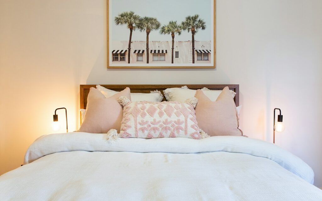
This is where dusty pink is at its best. A wall behind the headboard, or all four walls in a paler version, creates a cocooning space; white or greige linen bedding and light wood bedside tables complete the look without overloading it.
Living room
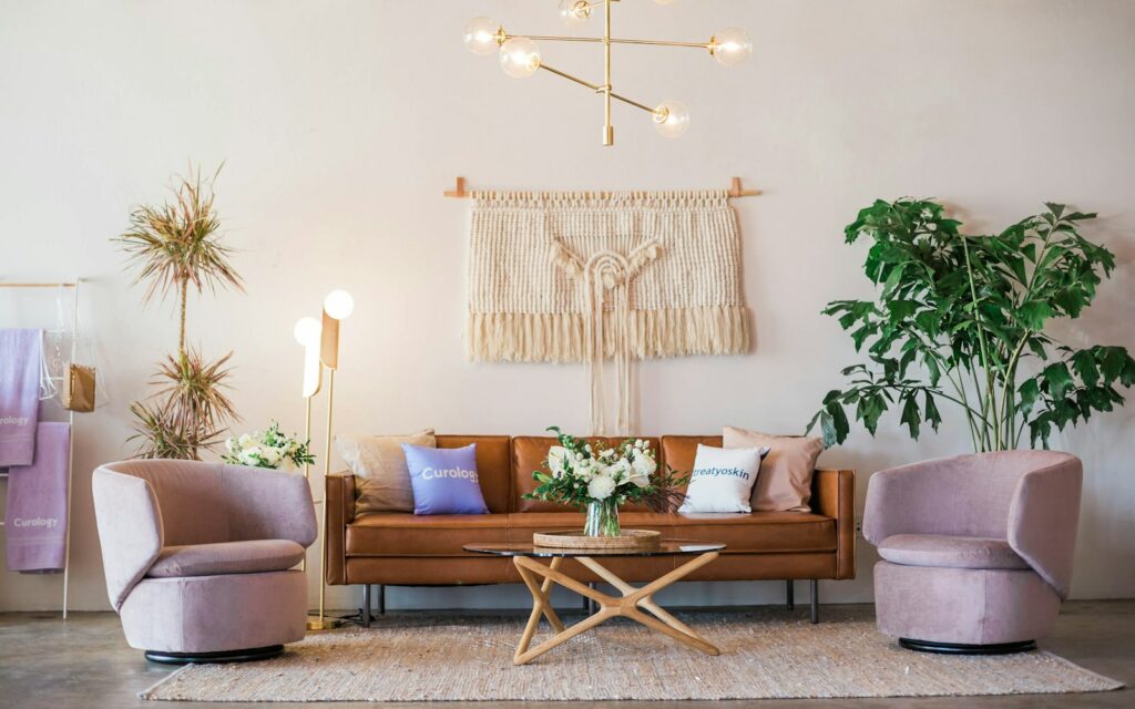
Here dusty pink comes in beautifully through a velvet sofa or armchair, where the sheen of the pile adds depth to the colour. With greige or taupe walls and a natural wool rug, the pink stays the star without taking over. To compare fabrics and finishes across brands, one useful reference is the Arredare Moderno catalogue, which brings together sofas, armchairs and upholstered beds from Italian manufacturers.
Bathroom
In the bathroom, bring in dusty pink with towels, a blind and small accessories, or paint one wall with a product suitable for humid rooms. With brass taps and white or pale grey tiles, the effect is warm and tidy.
Children’s room
For children, dusty pink is an alternative to pastel pink that grows with them: less babyish, it pairs well with natural wood and sage green and still works when the room belongs to a teenager.
Dusty pink walls: which finish and which light?
For walls, the safest choice is a washable matt emulsion, tested first with a large sample in the actual room. A matt finish brings out the chalky look of dusty pink, while a satin finish adds sheen and makes it look glossier. As an example, Sikkens describes its Alpha LumiMax Mat SF as a washable matt interior paint to be applied in two coats, covering 12 to 14 m² per litre per coat.
Paint makers have been looking at these tones too: Sikkens chose Sweet Embrace, code AN.02.76, as its 2024 colour of the year, describing its nuances as soft and delicate and showing it on pale pink walls in the campaign. Colour systems such as the Sikkens 5051 Color Concept, with more than 2,000 shades, let you find the right dusty pink by code.
Then there is the light. In north-facing rooms, where the light is cooler, choose a dusty pink with a warm undertone to avoid a grey, flat look; in bright south-facing rooms you can go for a greyer version. Look at the sample in the morning, in the afternoon and with the lamps on before you decide.
Frequently asked questions
Is dusty pink a warm or cool colour?
It is a warm colour: the brown undertone brings it close to warm neutrals. Greyer versions feel fresher, but they are still warmer than mauve.
Does dusty pink go with grey?
Yes, especially with a light, warm grey. With a very cold or dark grey, dusty pink can look dull.
What colour sofa goes with dusty pink walls?
A greige or cream sofa gives a tone-on-tone effect, a sage green one a soft contrast, and a cognac leather one adds warmth.
Where should you start?
If dusty pink appeals to you but feels like a risk, start with textiles: cushions, a throw, a curtain. If you still love it after a few weeks, move on to an armchair or a wall. Take the reference code with you, RAL or Pantone, and always ask for a sample: it is the simplest way to get exactly the pink you have in mind.
Sources
- RAL gGmbH, RAL CLASSIC and notes on the technical values of RAL colours: ral-farben.de
- Wikipedia, List of RAL colours (RAL 3014 Antique pink) and Old rose
- Pantone, Color Finder: 17-1718 TCX Dusty Rose, 17-1514 TCX Ash Rose, 16-1806 TCX Woodrose, 14-1506 TCX Rose Smoke
- Sikkens, 2024 colour of the year Sweet Embrace, colour collections and Alpha LumiMax Mat SF product sheet: sikkens.it